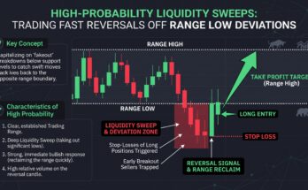
You have likely stared at a seemingly bullish chart, only to watch the price vanish into a violent market flush just as you entered your long position. We have all been there. It is the classic trap of the crypto markets: retail traders look for patterns in the price action, while smart money is busy dumping their inventory into the order books. If you are still relying purely on technical indicators like RSI or MACD to predict market tops, you are effectively ignoring the most critical source of truth: the movement of capital itself.
To anticipate the next “flush,” you have to stop watching the price and start watching the supply. By tracking Exchange Netflows and Realized Profit and Loss (P&L), you can identify the exact moment long-term holders begin moving their coins to exchanges to realize gains. This article will show you how to read these institutional signals so you can step out of the way before the liquidity runs dry.
Decoding Exchange Netflows: The Supply Shock Indicator
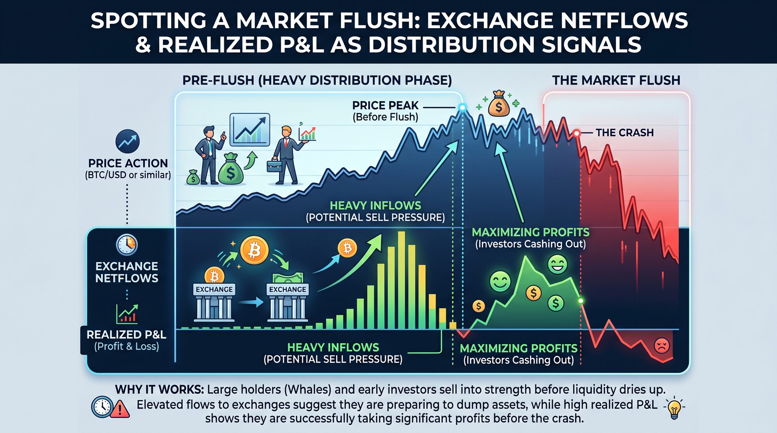
Exchange Netflows measure the total volume of an asset moving onto or off of centralized exchanges. When you see a massive spike in inflows—meaning thousands of BTC or ETH moving from cold storage to trading venues—you are witnessing a fundamental shift in supply dynamics. Whales do not move coins to exchanges to hold them; they move them to sell them.
Expert Insight: Don’t be fooled by a single hour of inflows. I look for a “sustained netflow trend”—a period of 48 to 72 hours where exchange balances are consistently growing. When the netflow balance increases while the price is trying to break out, it is a massive red flag. It indicates that every time the price climbs, someone is there to “fill the bid” with fresh supply, effectively capping the rally.
Realized P&L: Understanding the Whale Mindset
Realized Profit and Loss (Realized P&L) tells us the price at which coins were bought versus the price at which they were sold. When the Realized P&L metric hits extreme highs, it means the market has entered a “distribution phase.” Long-term holders, or “HODLers,” are finally capitulating on their positions, taking their profits off the table and moving back to cash.
Personal Example: I remember tracking a Realized P&L peak in early 2026. The price was hitting new local highs, but the realized profits were vertical. It was obvious that the “smart money” that bought the accumulation phase was now transferring those bags to retail buyers. I closed my long positions and shifted to a defensive stance. Three days later, the market flush erased 15% of the total value. The data didn’t guess; it showed the distribution in real-time.
The Divergence Signal: When Data Beats Price
The most potent signal occurs when Price Action and Realized P&L diverge. This happens when the price is still climbing, but the amount of realized profit being taken begins to flatten or decrease. It suggests that the “buying pressure” is becoming exhausted, as the sellers are no longer finding enough willing buyers to absorb their distribution without a price drop.
Expert Insight: If price makes a new high but Realized P&L fails to confirm that high, you are looking at a classic “distribution divergence.” This is the moment the market loses its structural support. I treat this divergence as my primary “de-risking” signal, regardless of what the moving averages say.
Managing Your Risk During Distribution Phases
When the data shows heavy distribution, you don’t necessarily need to short the market, but you must stop adding to your long positions. The risk-reward ratio has fundamentally shifted against you. During these phases, I tighten my stop-losses significantly and increase my allocation to stablecoins.
-
Watch the Exchange Balance: If exchange balances hit a multi-month high, stay in cash until the “flush” completes.
-
Monitor Profit Taking: High Realized P&L isn’t always bad, but extreme spikes usually mark the top. Wait for the cooling-off period where realized profits normalize.
-
The Flush Confirmation: A flush is confirmed when the price breaks support while exchange netflows remain positive. This proves that buyers have been overwhelmed by the supply currently sitting on the exchange books.

Market flushes are not accidents; they are the result of accumulated distribution that the market can no longer absorb. By monitoring Exchange Netflows and Realized P&L, you gain an objective view of the market’s internal health that no candlestick pattern can provide. Stop playing the guessing game and start following the capital. When the data says the smart money is exiting, believe it—and be the first one out the door.
FAQ
Where can I find Exchange Netflow and Realized P&L data?
On-chain analytics platforms like Glassnode, CryptoQuant, or Dune Analytics are the industry standards for tracking these institutional metrics.
What is the difference between “Exchange Balance” and “Netflows”?
Exchange Balance is the total amount of an asset sitting on exchanges, while Netflows is the rate of change (inflow minus outflow) over a specific time period. Netflows are more predictive for short-term price action.
Why do whales move coins to exchanges before a flush?
They need to place their sell orders in the centralized exchange order books. They cannot sell thousands of BTC through decentralized protocols without causing massive slippage.
Is it possible for high inflows to be bullish?
Yes, if they are moving to exchanges to be used as collateral for borrowing stablecoins, rather than being sold. Always check if the inflow is linked to a “stablecoin minting” event, which can be bullish.